Fall Decor Trends

Using Abstract Art to Warm up Your Living Space
As the leaves change color and the air cools, there is nothing quite like transforming your home into a cozy fall retreat. Warm earthy palettes are one of this year’s biggest decor trends. Autumn hued abstract art blends color, texture, and mood in a way that makes any space feel inviting. Here’s how to embrace that trend, plus ideas and inspiration to bring it to life.
Why Warm Abstract Art Works in the Fall
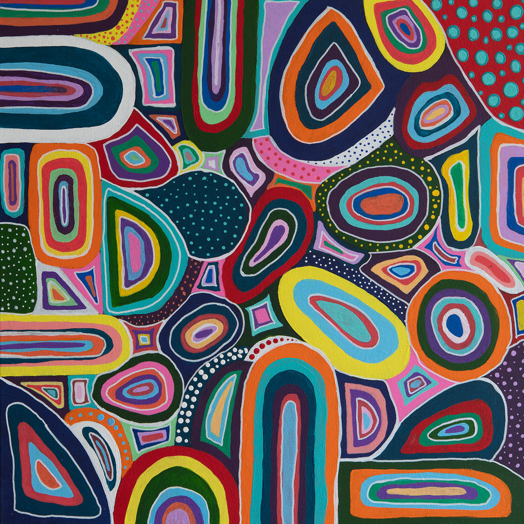
Warm abstract art embraces Autumnal hues. Rich tones like burnt orange, deep terracotta, golden yellows, rust, and cinnamon mimic the colors in fall landscapes. These colors naturally draw the eye and create a sense of comfort.
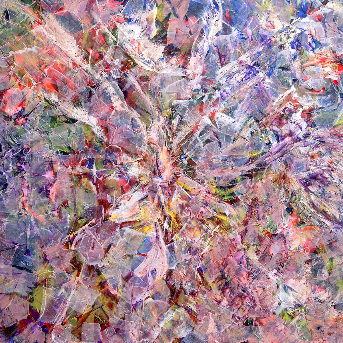
Abstract art adds texture and movement. Abstract works often use layering, impasto (thick paint), or mixed media which all add visual depth. These techniques engage the viewer and invite them into the painting, adding to the sense of warmth and relaxation. In the fall, texture is important-think cozy throws, natural fibers, and soft lighting. Abstract textures will pair well with those types of tactile elements.
Abstract art creates mood and atmosphere. Autumn hued abstract art brings the warmth and coziness of fall into your living space. Abstract art doesn’t tie you down to literal imagery. It allows your imagination to wander. In autumn, when we seek introspection, open ended abstract art encourages rest and relaxation.
Ways to Add Abstract Art to Your Home in the Fall
Add a statement wall piece – Choose a large canvas with warm tones and use it as a focal point above a sofa or fireplace.
Use accent corners – Art doesn’t always have to hang on walls - place framed pieces on a stack of books, or place one on a side table. Place abstract art on shelves, in reading corners, or in a small dining nook as in the image below.

Add Texture – Go for pieces with visible brushstrokes, mixed media and/or textured surfaces. These echo other fall materials -- such as wool and velvet -- to enhance the cozy factor.
Pair color palettes – Let your art guide your accent colors. For example, if your art piece has rusty orange and golden yellow, add throw pillows, curtains, and blankets in those same tones. Balance this with neutral walls and you will get a lot of warmth without overwhelming the space.

Pay attention to the lighting – Warm art benefits from warm lighting. Use soft incandescent bulbs, warm LED tones, sconces, floor lamps and candlelight. Highlighting with adjustable spotlights or picture lights can make the textures and colors in abstract art pop.
Try a gallery wall mix – Combine smaller abstract prints with autumn nature photography. Use similar framing so the theme feels cohesive.
Tips & Mistakes to Avoid:
1 Don’t overcrowd: If you have strong color and texture in your art, give it space to breathe. A clean wall with minimal surroundings will set an art piece apart and help it shine.
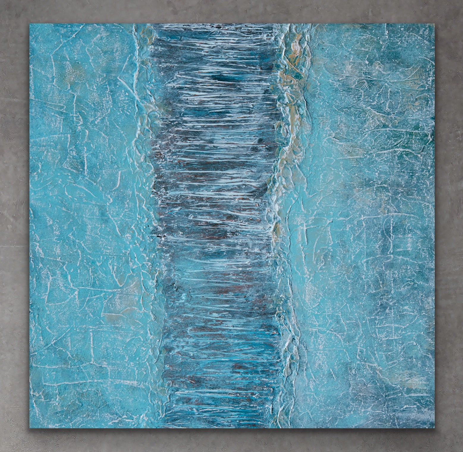
2 Balance warm with cool: Without any cooler tones, warm art can feel heavy. Consider small cooler accents (dusty blue or muted green) in pillows or ceramics. Or go for bold and pair a warm painting with cooler colored walls. The dark green in the image below makes the warmer hues of this painting really pop!

3 Scale matters: Too small a piece feels lost; too large a canvas can dominate. Measure your wall and furniture first. A large piece will work best over a long sofa, fireplace or credenza; clusters of smaller works look great in a hallway or going up a staircase.
4 Frame choice counts: A heavy ornate gold frame might clash with abstract modern pieces. Either go for no frame or stick with a simple black frame for fall.

This fall, let abstract art do the heavy lifting of mood in your home. It’s endlessly flexible, visually rich, and deeply comforting. Whether you are aiming for a radiant golden harvest glow, a rustic cabin feel, or a modern cozy escape, warm abstract art can be your go-to for adding texture, color and statement.